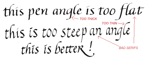
Watch your pen angle!
If your pen angle is incorrect, the thickness of the
horizontal and vertical strokes will not be balanced. Look at the example
below.
When the pen is held so the barrel (handle) points too far out to the side, the angle is too steep and the horizontal parts of the letters appear too thick while the vertical strokes are too thin.
When the pen is held so the barrel does not point out to the side enough (too flat an angle), just the opposite occurs - the verticals are too thick and the horizontals are too thin.
Bad pen angle makes the serifs look awful. Notice the serifs in the words, "flat" and "an" in the example below.
x
x
x